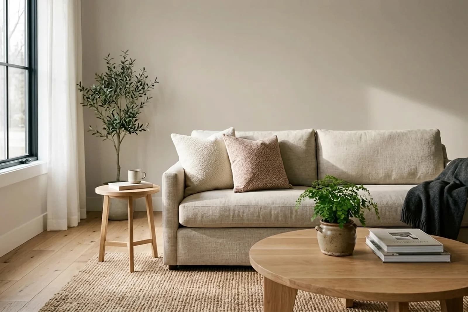
Accessible Beige is the color of choice when a room's fixed finishes already lean warm and a cooler greige would fight them. It's a true beige-leaning greige — warmer than Agreeable Gray, less cool than Repose Gray, and calibrated to work with honey-toned oak, travertine, warm granite, and the kind of existing interior that simply won't accept a cool gray without looking mismatched. With an LRV of 58 it maintains the same brightness as its Sherwin-Williams greige peers, but its undertone is honest beige — a color that declares its warmth rather than hiding it.
Undertones and Lighting Behavior
Accessible Beige carries a clear beige-yellow undertone with a muted gray base. Under north-facing cool daylight, the color softens and reads more as a neutral greige; in this condition it comes closest to reading similarly to Agreeable Gray. Under warm LED and incandescent lighting, the beige character emerges clearly, giving rooms a warm, honeyed envelope that flatters wood and skin. In south-facing strong sun, the color can appear noticeably warmer and in rare cases tips toward a soft tan. Accessible Beige is the most lighting-stable warm greige in the Sherwin-Williams line — it doesn't swing cool in cold light the way Agreeable Gray sometimes does.
Where to Use Accessible Beige in the Home
Accessible Beigeperforms differently across rooms. Here’s how it reads in the spaces where it’s most often specified.
AI-assisted visualization. Wall color digitally matched to Sherwin-Williams Accessible Beige (SW 7036).
Living Room
Accessible Beige in a living room creates a warm, comfortable envelope that flatters traditional furniture and warm-toned floors. It pairs especially well with honey-oak, cherry, or older hardwood flooring that a cooler greige would make look yellow by comparison. Layer with cream linens, warm leather, and a crisp warm white trim (Pure White or Alabaster).
More living roompaint colors →AI-assisted visualization. Wall color digitally matched to Sherwin-Williams Accessible Beige (SW 7036).
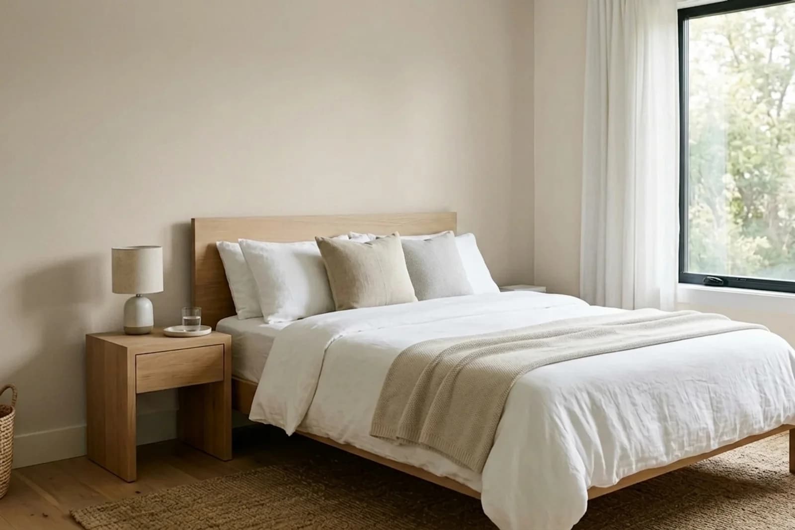
Bedroom
Accessible Beige in a bedroom delivers a restful, slightly warm backdrop that photographs beautifully and pairs with every textile palette. It's particularly flattering in primary bedrooms with golden-hour afternoon light, where the beige undertone amplifies the warm glow without becoming aggressive.
More bedroompaint colors →AI-assisted visualization. Wall color digitally matched to Sherwin-Williams Accessible Beige (SW 7036).
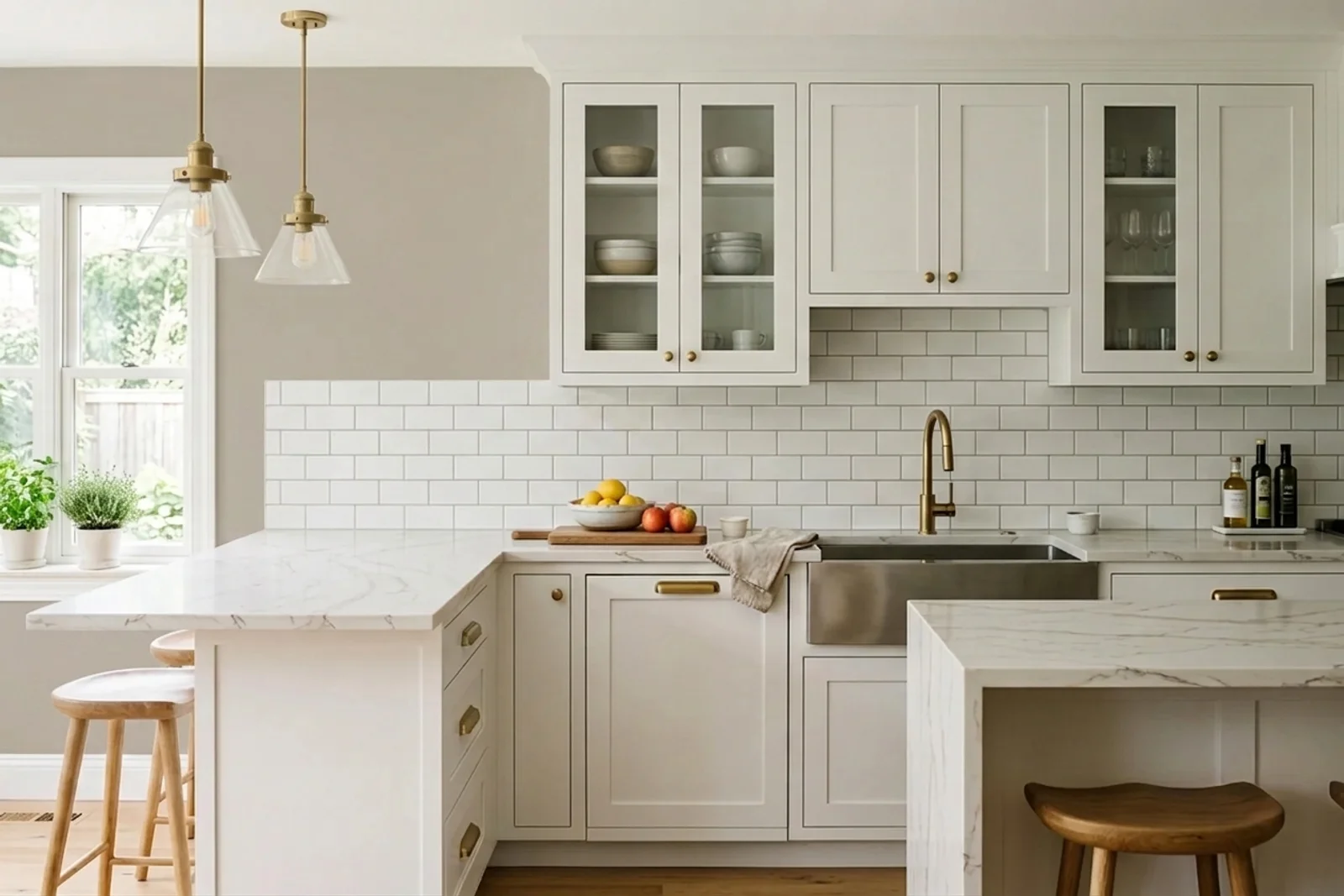
Kitchen
Accessible Beige is one of the best choices for kitchens with warm-toned cabinetry, travertine or warm granite counters, and honey-oak cabinets. It's less successful with strongly cool finishes (pure-white marble, cool-gray subway tile), which can make the walls look overly beige by contrast. Use in a scrubbable matte or eggshell finish rated for kitchens.
More kitchenpaint colors →AI-assisted visualization. Wall color digitally matched to Sherwin-Williams Accessible Beige (SW 7036).
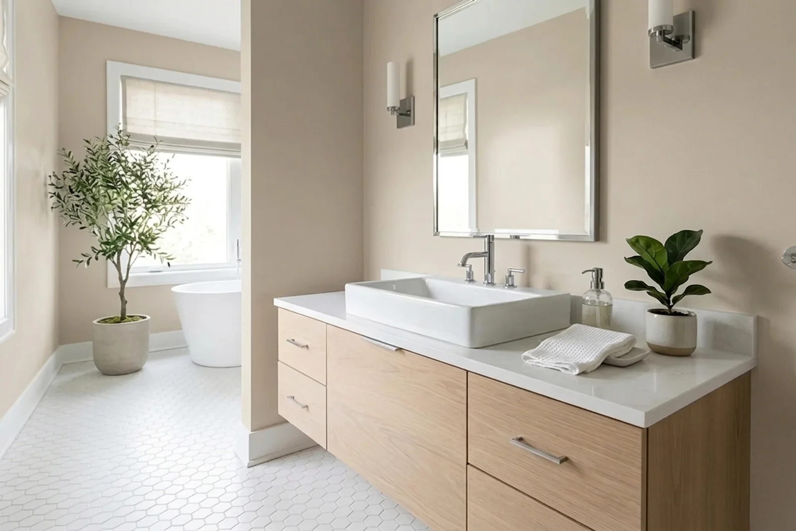
Bathroom
Accessible Beige in a bathroom delivers spa warmth that pairs especially well with travertine tile, beige-veined marble, and bronze or brass fixtures. It's not the best match for pure-cool bathroom palettes — white-subway-and-chrome bathrooms look crisper against a cooler wall color. In warm-palette bathrooms, Accessible Beige is close to default.
More bathroompaint colors →AI-assisted visualization. Wall color digitally matched to Sherwin-Williams Accessible Beige (SW 7036).
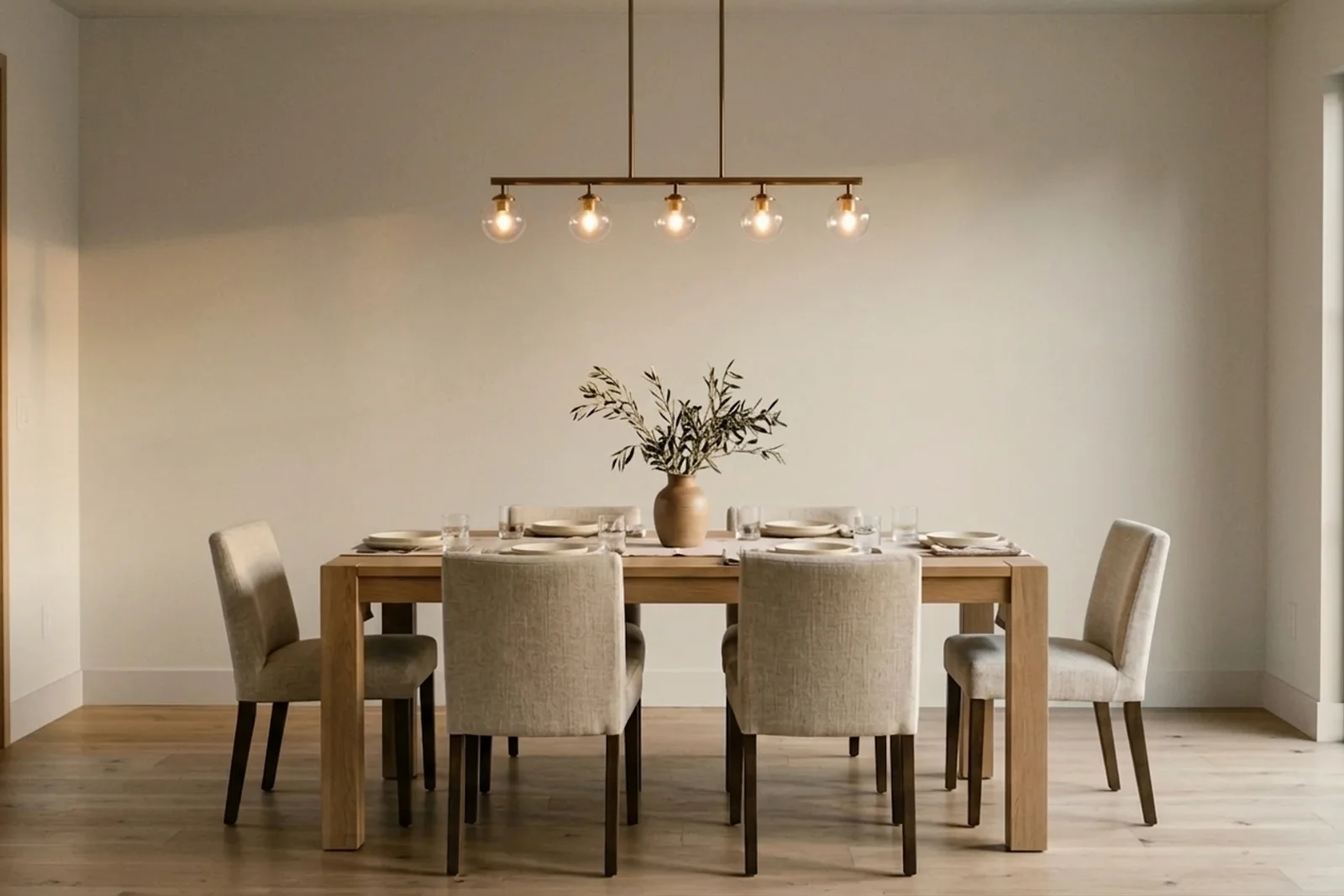
Dining Room
Accessible Beige in a dining room produces a warm, candlelit envelope that flatters food, skin, and wood dining furniture. It's especially effective against cherry, walnut, or older oak furniture and pairs naturally with aged brass chandeliers and oil-rubbed bronze hardware. Consider an eggshell or pearl finish to enhance the room's evening warmth.
Natural honey-oak cabinetry with Accessible Beige walls
Cream lacquer uppers with walnut lower cabinets
Material and Finish Pairings
Honey-oak, cherry, and walnut flooring
Travertine, beige-veined marble, and warm quartzite
Aged brass, oil-rubbed bronze, and antique bronze hardware
Linen, jute, wool, and cotton in warm neutrals
Accessible Beige Compared to Similar Colors
Accessible Beige is the warmest of the major Sherwin-Williams mid-tone neutrals. Compared to Agreeable Gray (SW 7029, LRV 60), Accessible Beige is clearly warmer and more beige-leaning; Agreeable Gray reads cleaner and less saturated. Against Repose Gray (SW 7015, LRV 58), the contrast is striking — Repose reads as a true gray, Accessible Beige as a warm tan in side-by-side comparison. Benjamin Moore's closest analogue is Edgecomb Gray (HC-173, LRV 63), which is a similar warm greige at a slightly lighter LRV. Among warm beiges, Accessible Beige is the preferred modern choice — it's less yellow than older beiges like Kilim Beige (SW 6106) and carries enough gray to avoid looking dated.
Accessible Beige (SW 7036) has an LRV of 58, which places it firmly in the mid-tone range. It's light enough to keep most rooms feeling open but has enough depth to hold color on the wall rather than reading as a near-white.
Is Accessible Beige warm or cool?
Accessible Beige is unambiguously warm. Its undertone is a clear beige-yellow over a muted gray base — warmer than any other mainstream SW greige. It's specifically designed for homes with warm fixed finishes where a cooler greige would create temperature mismatch.
Accessible Beige vs. Agreeable Gray?
Use Accessible Beige when your fixed finishes (floors, counters, tile) lean warm and yellow. Use Agreeable Gray when your finishes are more neutral or cool. Side-by-side, Accessible Beige reads noticeably warmer and more beige; Agreeable Gray reads cleaner and more balanced. Whichever matches your fixed finishes is the right pick.
Does Accessible Beige look yellow?
In warm lighting and especially under strong afternoon sun, yes — the beige undertone amplifies and the color can briefly read as a warm tan. Under cool or neutral light, the warmth moderates and the color reads more as a balanced greige. This is expected behavior for any warm beige; if you want to minimize the shift, specify warm-white (2700K) LED bulbs in the room for a consistent presentation.
Is Accessible Beige a good whole-house color?
Yes, for homes with warm-toned fixed finishes and open floor plans. Accessible Beige's lighting stability makes it a reliable whole-house neutral when the home skews warm. For homes with cool or mixed palettes, a more balanced neutral like Agreeable Gray or Repose Gray will integrate more easily across different rooms and light conditions.
Design Tip
The most common Accessible Beige mistake is pairing it with cool-white trim. A pure-cool trim white (Extra White, Chantilly Lace) against Accessible Beige walls makes the beige look yellower and the trim look blue-tinged. Commit to a warm-leaning trim — Alabaster, Pure White, or White Dove — and the temperature harmony will let the beige read as intentional warmth rather than an awkward yellow cast.
Accessible Beige Mood and Style in the Home
The moods Accessible Beige most often produces, and the interior design styles it fits most naturally.
Moods
CozyGroundingCalm
Interior Design Styles
TraditionalFarmhouseTransitional
Final Thought on Accessible Beige
Accessible Beige is the right answer to a specific question: what's the modern warm neutral for a home with warm fixed finishes? It avoids the dated yellow of older beiges, pairs harmoniously with honey-toned flooring and travertine, and stays more stable across lighting conditions than most of its greige peers. If your instinct tells you Agreeable Gray will fight your floors, or your existing finishes pull too warm for a neutral greige, Accessible Beige is the reliable designer-grade alternative.