Sherwin-Williams Alabaster (SW 7008): Warm Creamy, Softened White Paint Color

Hex #EDEAE0 · LRV 82 · warm white

Best for

Alabaster was Sherwin-Williams' 2016 Color of the Year, and the industry never quite let it go. It is the warm, creamy off-white that designers reach for when pure white feels too stark — soft enough to take the edge off morning sunlight, warm enough to flatter wood and brass, and quiet enough to recede behind even the most ambitious art walls. With an LRV of 82 it reflects nearly as much light as a pure white, but its slightly warm undertone keeps a room feeling livable rather than gallery-cold. It is the house's softest possible whole-wall neutral.

Undertones and Lighting Behavior

Alabaster's warmth comes from a faint beige-yellow undertone — too subtle to read as a beige, but unmistakably present when compared to a true white like Chantilly Lace or Pure White. In north-facing rooms Alabaster loses almost none of its warmth and continues to read as a clean soft white. Under warm LED or incandescent light it deepens slightly and can take on a faint cream cast, which is usually the desired effect in living and bedroom spaces. Under very cool daylight bulbs (5000K+) the warmth reads more muted; if you need Alabaster to stay consistent in a mixed-lighting space, spec warm-white (2700K–3000K) bulbs for predictable behavior.

Where to Use Alabaster in the Home

Alabasterperforms differently across rooms. Here’s how it reads in the spaces where it’s most often specified.

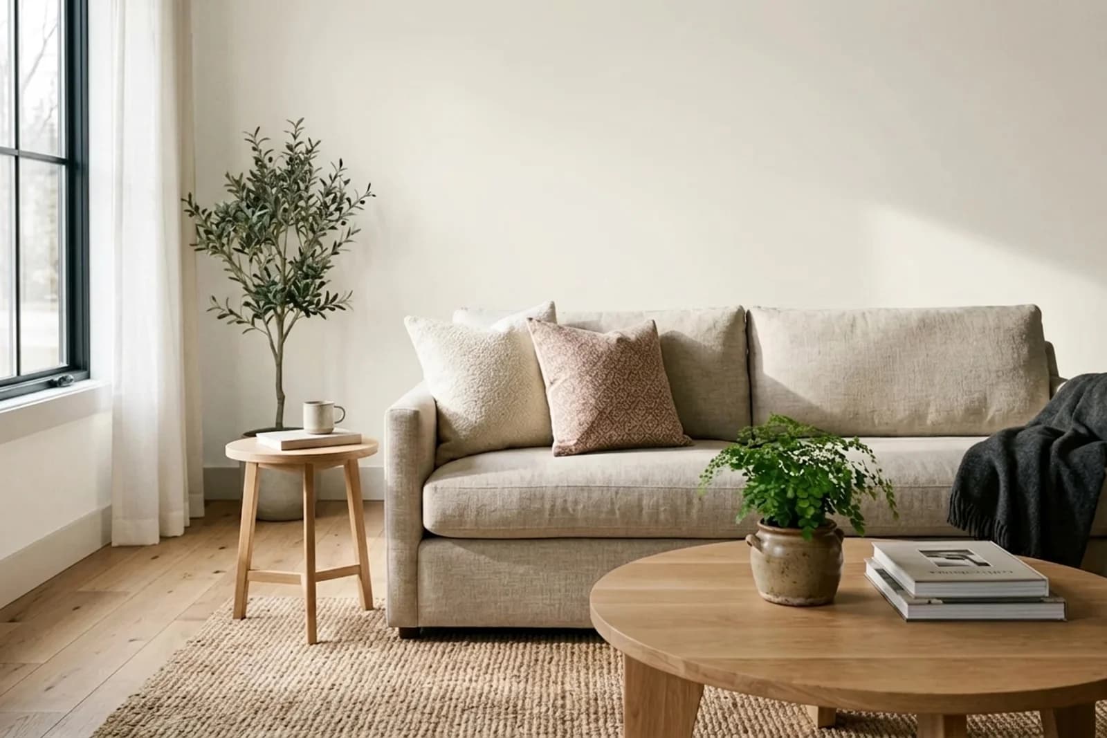
Alabaster SW 7008 on the walls of a living room. AI-assisted composite.
AI-assisted visualization. Wall color digitally matched to Sherwin-Williams Alabaster (SW 7008).

Living Room

Alabaster makes a living room feel instantly more welcoming than a stark white without sacrificing brightness. Its warmth pairs beautifully with warm wood floors, linen upholstery, and natural-fiber rugs. Use it as the whole-wall color with a slightly whiter trim (Pure White or Extra White) for subtle architectural separation, or carry Alabaster up the walls and trim for the popular envelope-in-one-color treatment.

More living roompaint colors →
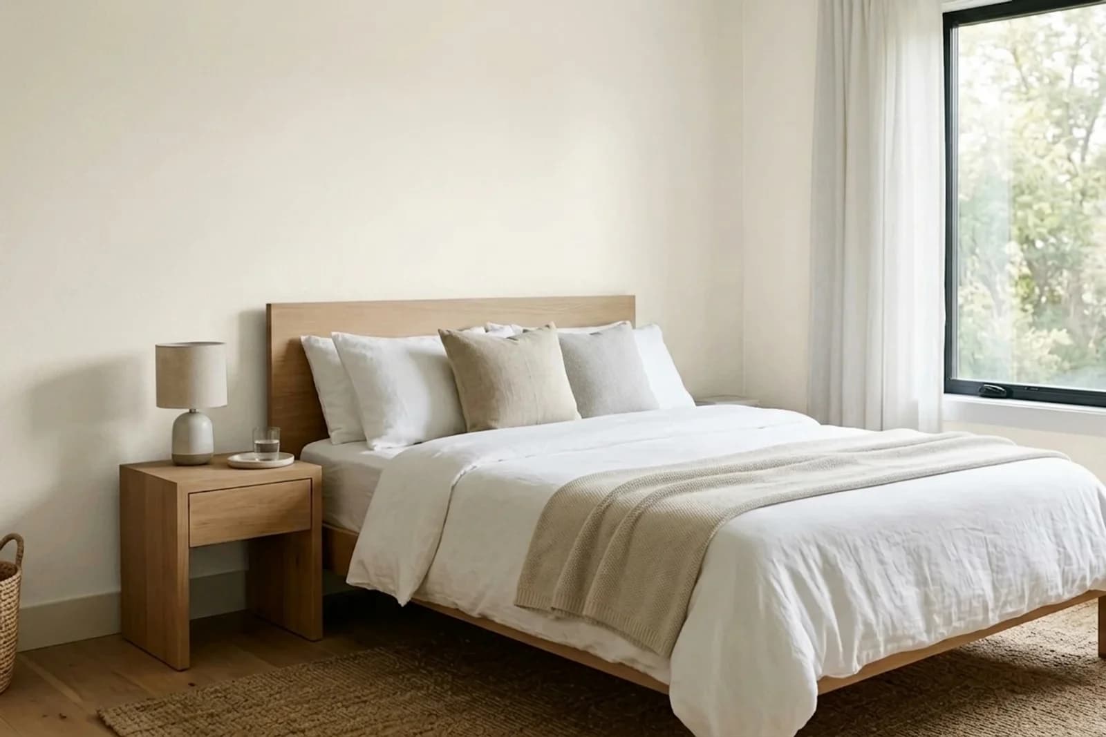
Alabaster SW 7008 on the walls of a bedroom. AI-assisted composite.
AI-assisted visualization. Wall color digitally matched to Sherwin-Williams Alabaster (SW 7008).

Bedroom

In bedrooms, Alabaster's soft warmth produces a restful, enveloping effect without dipping into the moodier LRV range. It's one of the few whites that can work in a bedroom that gets strong morning sun — the warm undertone keeps the room feeling soft rather than glaring. Pair with deeper neutral bedding or a muted wall art palette.

More bedroompaint colors →
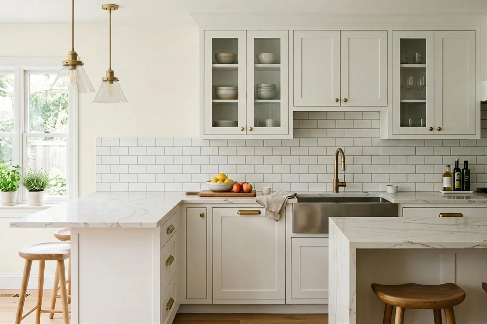
Alabaster SW 7008 on the walls of a kitchen. AI-assisted composite.
AI-assisted visualization. Wall color digitally matched to Sherwin-Williams Alabaster (SW 7008).

Kitchen

Alabaster is among the most-specified kitchen wall and cabinet colors in the country. On cabinets it produces a creamy classic look that avoids the coldness of pure white; on walls it complements both white and natural wood cabinetry. Always use a premium cabinet-grade paint (alkyd or waterborne-alkyd) when painting cabinets in Alabaster — it will chip without it.

More kitchenpaint colors →
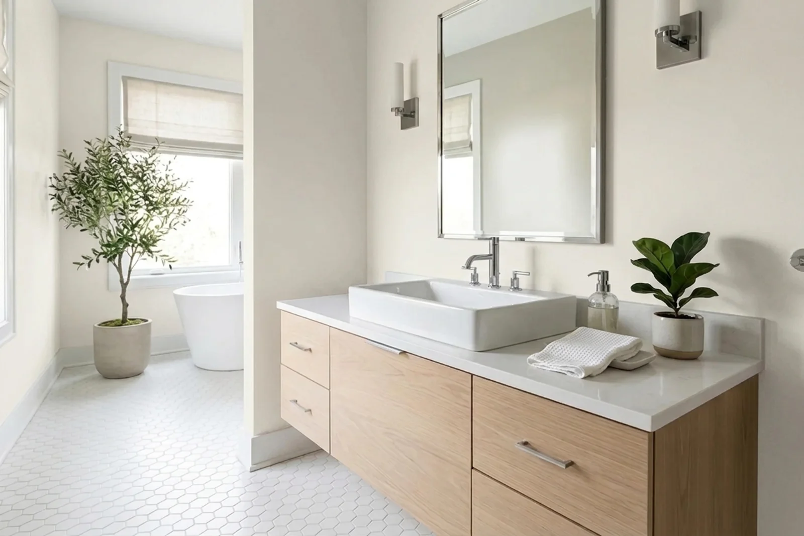
Alabaster SW 7008 on the walls of a bathroom. AI-assisted composite.
AI-assisted visualization. Wall color digitally matched to Sherwin-Williams Alabaster (SW 7008).

Bathroom

Alabaster delivers spa warmth in a bathroom without tipping into a yellow or cream read. It pairs particularly well with marble-look tile, brass hardware, and warm wood vanities. In small bathrooms it's especially effective because its high LRV maximizes reflected light while the warm undertone keeps the space from feeling clinical.

More bathroompaint colors →
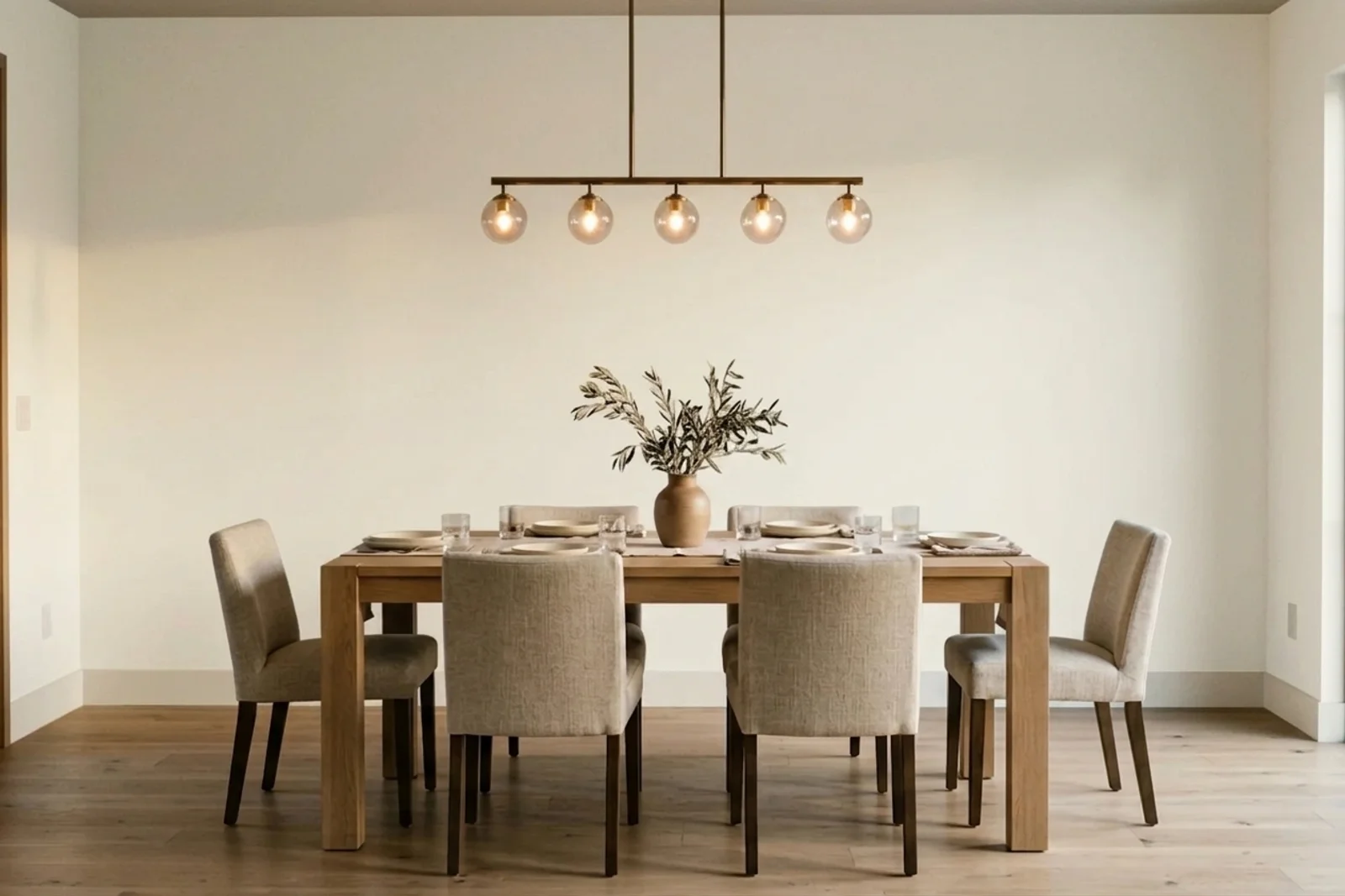
Alabaster SW 7008 on the walls of a dining room. AI-assisted composite.
AI-assisted visualization. Wall color digitally matched to Sherwin-Williams Alabaster (SW 7008).

Dining Room

In a dining room, Alabaster produces the soft, gallery-inspired warmth that makes art pop and candlelight flatter. It's often paired with a deeper accent wall (Urbane Bronze, Hale Navy) or with deep stained wood furniture. Consider a slightly reflective finish — satin or pearl — to bounce evening light.

More dining roompaint colors →

Coordinating Colors and Material Pairings

These are the finishes, neighboring colors, and natural materials that reliably pair with Alabaster in the most common interior applications.

Trim Colors

Accent Color Families

  • Warm greige (Agreeable Gray, Revere Pewter)
  • Muted blue-greens (Sea Salt, Healing Aloe)
  • Deep navy (Hale Navy, Naval)
  • Warm clay and terracotta

Cabinet Pairings

  • Alabaster painted shaker fronts (monochrome kitchen)
  • Natural white oak with Alabaster walls
  • Deep navy or greige lowers with Alabaster uppers

Material and Finish Pairings

  • White oak or honey-toned wood flooring
  • Honed Carrara or calacatta marble
  • Unlacquered brass or aged brass hardware
  • Linen, wool, and cotton in warm whites and soft neutrals

Alabaster Compared to Similar Colors

Alabaster sits in the warm-soft camp of off-whites. Compared to Pure White (SW 7005, LRV 84), Alabaster is noticeably warmer and softer; Pure White is the more balanced, slightly cooler everyday white. Against Benjamin Moore White Dove (OC-17, LRV 83), the two are close enough that designers often substitute — White Dove has a marginally greener-gray undertone where Alabaster leans more yellow-beige. Chantilly Lace (OC-65, LRV 90) is considerably whiter and brighter; use it when you want a high-contrast trim against Alabaster walls. Simply White (OC-117, LRV 89) is a cleaner, slightly cooler soft white — less creamy than Alabaster, still warm enough to feel inviting.

Paint Color FAQs

What is the LRV of Alabaster?
Alabaster (SW 7008) has an LRV of 82, which places it firmly in the 'soft white' category — bright enough to feel like a clean white and reflective enough to brighten a room, but not quite as stark or reflective as a pure white at LRV 90+.
Is Alabaster warm or cool?
Alabaster is a warm off-white. Its undertone is a muted beige-yellow rather than the slightly blue cast of a cool white. The warmth is subtle enough that it still reads as a white rather than a cream, but noticeable when compared directly against a cool or neutral white like Chantilly Lace.
Is Alabaster the same as White Dove?
They're close enough that designers sometimes use them interchangeably, but they're not identical. Alabaster leans slightly yellow-beige; White Dove has a faint green-gray undertone. The difference is most visible in bright daylight or under cool LED light. For a direct side-by-side comparison in your actual room, sample both before committing.
Can I use Alabaster on kitchen cabinets?
Yes — Alabaster is one of the top-specified cabinet colors nationwide. It delivers a classic, creamy white look that avoids the coldness of pure whites and pairs well with almost any counter material. Always use a cabinet-grade paint (Sherwin-Williams Emerald Urethane or Benjamin Moore Advance) and proper prep — standard wall paint will chip within a year.
Does Alabaster look yellow?
Under most lighting conditions, no — the warmth reads as softness rather than yellow. In rooms with very strong warm light (2200K bulbs, sustained direct late-afternoon sun), Alabaster can briefly take on a slightly creamier look, but this is the same effect any warm white produces. If you prefer a warm white that stays whiter under warm light, look at Pure White or Simply White.

Design Tip

The most common Alabaster mistake is pairing it with a pure-cool trim white. The warm-cool mismatch makes Alabaster look yellower than it is and makes the trim look slightly blue. Stick with warm-leaning trim whites — Pure White, Extra White, or Alabaster itself on the trim for a tone-on-tone envelope — and the color will sit beautifully in the room.

Alabaster Mood and Style in the Home

The moods Alabaster most often produces, and the interior design styles it fits most naturally.

Moods

AiryCozyCalm

Interior Design Styles

FarmhouseTraditionalTransitional

Final Thought on Alabaster

Alabaster's staying power reflects a simple truth about residential paint: most homeowners want their white to feel warm, but not obviously warm. Alabaster delivers exactly that — a soft white with quiet personality that brightens a room without calling attention to itself. If your instinct tells you pure white will feel too clinical but a cream will feel dated, Alabaster is almost always the right answer. Sample it against your fixed finishes, pair it with a sympathetic trim white, and it will work across every room in a modern or traditional home.